Alex Viehman, “Museum #9066,” Fall 2013
 The greatest design challenge I had was trying to put myself in a Japanese American citizen’s shoes back in the 1940’s. Most of these citizens came from all over the United States. I wanted to get the sense of being in the camp (visualizing myself in the camp) and experiencing the same feelings, emotions, hardships, and even the positives of the Japanese Internment camp at Rowher.
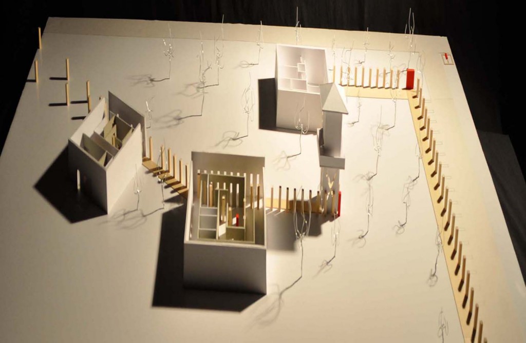
 I designed my building with the intent that once you drive onto the camp you’re in the camp, you become an internee or a “post”. And once you step on the sidewalk “on the other side of the posts” you’re in the camp and now on the long journey of a different life. When you come to the first “red” post you visualize the poster that the Japanese American citizens read when they were forced into the camps.
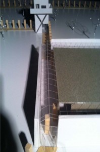
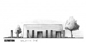
The posts lead you on into the Processing building and you get your id number/tag, then your pushed on out into the environment which gives you the experience of walking on wood planks in the camp. The posts are now leading into the Barracks building where you are funneled into the experience of being inside a barrack and the cut outs of the angled wall where light shines through (resembling the guard tower spot light) which puts you on focus.
The “red post” resembles the change of getting out of the camp, but its a far journey to get out. The “posts” start to become staggered and break apart and you will notice that the “posts” are now on your right hand side and you see out of the camp, your leaving the camp and going to the Removal building.
 Here is where you get to the end and see the posts leading out into the landscape but this resembles how even though an internee may leave the camp the journey wasn’t over. there was still hardship on getting jobs, starting life over from scratch, and thats the reason why you now have to walk all the way back through the buildings which is causing you to reflect on what you had just experienced.


